The most common argument in the first week of moving into a new office isn't who gets the window seat — it's whether the desks even fit. You worked out one version in your head, your coworker worked out another, and when you actually measure the space, the walkway is only wide enough for one person to squeeze through sideways. That's when you need an office seating chart.
This article is the overview for work and commercial space floor planning — from what a seating chart actually is, and how it differs from a seating list, to the must-know principles of seating density, walkway width, and evacuation routes, then how office, retail, and studio spaces each get laid out, and finally a demonstration of using Roomfit to draw a 1:1 floor plan and generate a collaborative editing link to share with your team. It covers "how to think about it, how to draw it, and how to present it" all in one pass.
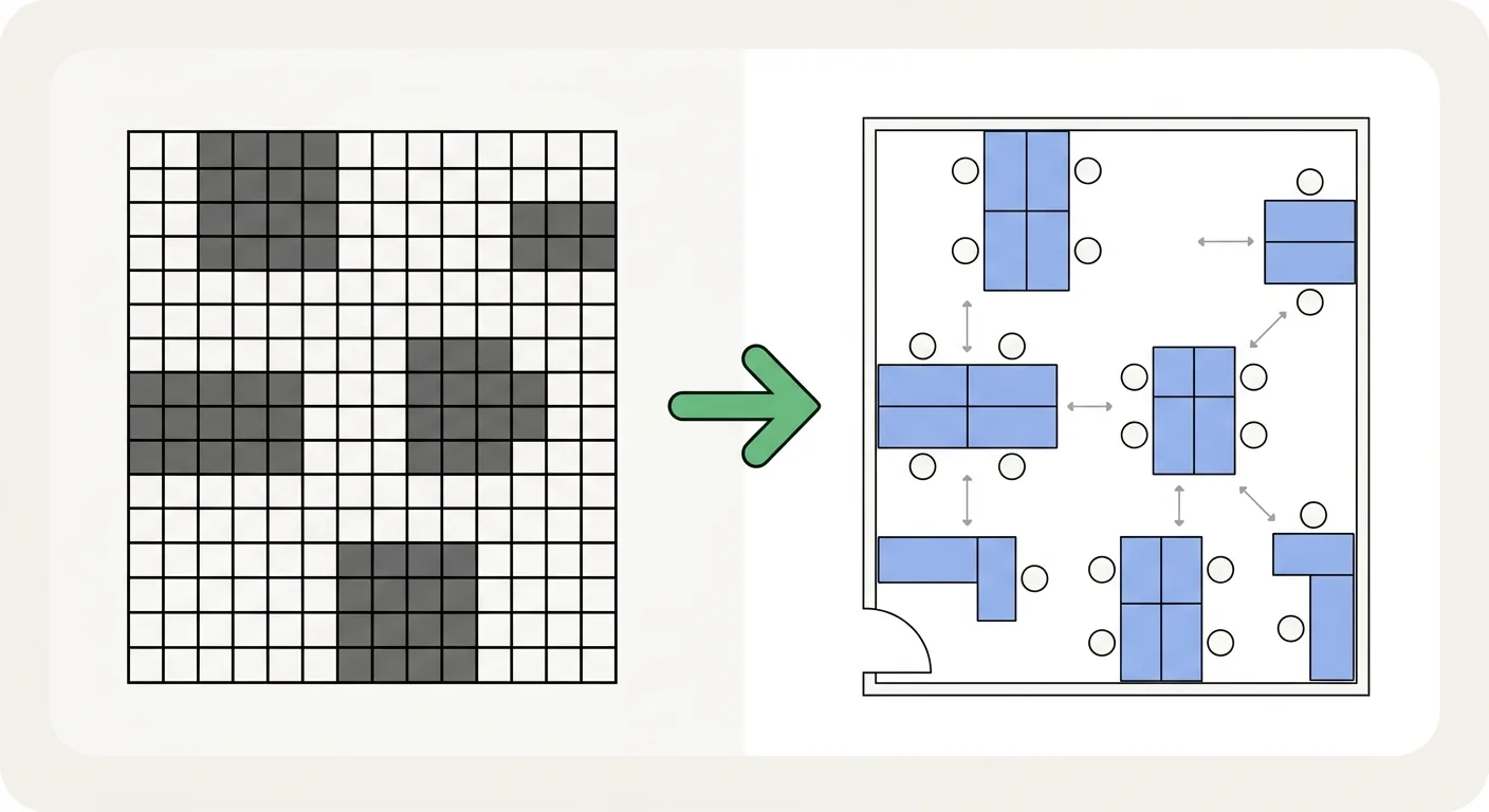
Caption: An office seating chart = a true-scale space outline + desks and chairs marked in position + reserved walkways + clear department zoning
Key takeaway: An office seating chart is a floor plan showing desk positions and department zoning drawn at true scale. In 2026, the global average office utilization rate recovered to 53%, and 62% of companies have adopted a shared-desk ratio higher than 1.5:1 (CBRE, 2026) — "who sits where, how many days" needs a chart to manage it more than ever before.
1What Is an Office Seating Chart? Understanding the Difference Between Seating, Department Zoning, and a Seating List
An office seating chart is a floor plan drawn at the space's true proportions, showing where every desk and chair sits and marking out department zones. It's become more important in 2026 because hybrid work means seats are no longer "one person, one fixed spot" — CBRE's 2026 statistics show that 96% of companies now have a clear in-office policy, most commonly requiring at least three days a week in the office (CBRE, 2026). How seats are assigned and how shared desks rotate all need a chart to be clear about.
When we helped a friend's company of a dozen or so people move offices, the first round was done verbally — "you sit here, he sits there" — and three people ended up with three different versions in their heads. Switching to drawing a seating chart first cut the disputes in half on the spot.
Defining an Office Seating Chart: A Space Floor Plan With Desk Positions and Department Zoning Marked
A seating chart answers a spatial question: how big is this area, how are the desks arranged, where's the walkway, and which zone belongs to which department. It's drawn "to scale," not sketched by hand. Draw it accurately, and if it fits on the chart, it really fits.
A usable seating chart typically includes four elements: the space outline (including doors, windows, and columns), desk and chair positions, walkway corridors, and department or group zoning. Skip the walkway, and the chart is just "cramming desks in"; skip the zoning, and it becomes hard to maintain when personnel change.
Seating Chart vs. Seating List: One Is Spatial Position, the Other Is a Name Mapping
Many people mix up "office seating chart" and "office seating list," but the two serve different roles. A seating chart is a spatial position — which corner of the room this desk sits in. A seating list is more like a name list or spreadsheet, answering "which row, which number is this person at."
The two work best together. The seating chart handles "how the desks are arranged and where the walkways go," and the seating list handles "which seat maps to which person." In practice, you'd draw the chart first, then fill in names — once the chart is set, the list is just matching seat numbers to names.
When Do You Actually Need a Seating Chart
You don't need one every day, but a few situations get messy without one: moving into a new office and reconfiguring, a department reorg that shifts zones, arranging staggered seating for epidemic prevention, or temporarily arranging seats for an event or training session. What they have in common: whenever the space or personnel changes, the original layout has to be redone.
There's another commonly overlooked scenario: evaluating an office before you lease it. Does the space you're viewing actually fit your existing desks and meeting rooms? Drawing a seating chart first is far more reliable than eyeballing the square footage.
25 Core Principles of Work and Commercial Space Layout: Seating Density, Walkway Width, Evacuation Routes, and Department Adjacency
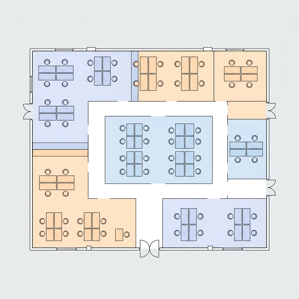
Arranging seats isn't just about cramming in desks — five things need attention at once. First, a sense of scale: in 2026, average office space per employee lands at 100 to 150 square feet (roughly 9 to 14 m², including walkways and common areas), a clear drop from about 225 square feet before 2020 (YAROOMS, 2026). With space shrinking, every unit of density and every walkway needs to be carefully accounted for.

Caption: Five core layout principles — (1) seating density (2) walkway width (3) evacuation route (4) department adjacency (5) natural light and orientation
Seating Density: How Much Space Per Person, and the Cost of Too Tight or Too Loose
Density is "how much space, on average, each person gets." Too tight, and traffic flow jams, noise rises, and morale drops; too loose, and you're paying rent for nothing. A common 2026 breakdown: high density is about 80 to 150 square feet, standard is about 150 to 250, and spacious is about 250 to 500 (YAROOMS, 2026).
Converted into an easier number to remember: roughly 9 to 14 m² per person is the common range for startups and hybrid offices. This figure includes walkways and the break room, not just desk surface. The most practical way to find your own reasonable value is to arrange it once at actual dimensions and see. For a detailed desk and furniture dimension reference, see the sizing quick-check in Office Seating Chart Tutorial.
Walkway Width: How Much Space to Leave for Main and Secondary Aisles, and Room for Wheelchairs and Carts to Pass
The walkway is the spot most commonly squeezed, and the one you can least afford to skimp on. Taiwan's Building Technical Regulations, Architectural Design and Construction Section, Article 92, explicitly regulates corridor width: for general buildings where a single floor's room area reaches 200 square meters or more, a corridor with rooms on both sides needs to be at least 1.60 meters, and other corridors at least 1.20 meters; for floors under 200 square meters, corridors also need to be at least 1.20 meters (Laws & Regulations Database of The Republic of China).
This is the regulatory floor — in practice, the main walkway should be left wider to let two people cross and let carts or wheelchairs pass through; secondary walkways at least need to let one person pass comfortably. Drawing the walkway on the chart makes it obvious at a glance — trying to eyeball it is the easiest way to underestimate.
Evacuation Routes: Entrances and Escape Directions Can't Be Blocked by Desks and Chairs
The evacuation route is the one principle you can least afford to compromise on. Under the Building Technical Regulations' evacuation provisions, for most office uses (Categories B and D), the walking distance from any point indoors to the nearest direct staircase generally can't exceed 30 meters (Laws & Regulations Database of The Republic of China, 2026).
In practice, hold to two things: don't place desks and chairs in front of entrances, and keep the path toward the evacuation direction clear. When drawing a seating chart, mark the doors and evacuation route first, then arrange desks in whatever space is left — do it backwards, and it's easy to find, only after the fact, that you've blocked an evacuation door.
Department Adjacency: Put Frequent Collaborators Close Together, Keep Noisy Zones Away From Focus Zones
Seating isn't only about space — it's also about how people interact. Put departments that meet and hand off work often closer together, and you save the back-and-forth commute time. Conversely, keep "noise sources" like meeting rooms, break rooms, and sales areas with lots of calls as far as possible from zones that need focus, like engineering or finance.
A useful method: connect the "high-frequency collaboration" groups with lines on the chart first — whichever pair has the most connecting lines should be adjacent. This is more evidence-based than arranging by impression, and it's easier to explain to a manager why you zoned it this way.
Natural Light and Orientation: Windows, Columns, and AC Vents All Affect Seating Comfort
Within the same office, a seat by the window and one beside a structural column feel very different. Where natural light comes from, whether the screen glares or has backlight, and whether the AC vent blows directly on someone's head — these details decide how comfortable it is to sit there.
My recommendation is to orient screens perpendicular to windows, avoiding facing directly toward or away from a window to prevent glare and backlight. Mark "landmine spots" — under a beam, directly below an AC vent — when drawing the chart, and avoid assigning seats there whenever possible.
3Use Roomfit to Draw a 1:1 Floor Plan and Arrange Seats: Import Space Dimensions, Drag Desks and Chairs, Automatically Label Clearance
The step that always jams up drawing a seating chart is "scale." Hybrid work makes this happen even more often — CBRE's 2026 survey shows about 57% of companies plan to shrink their office space over the next three years (CBRE, 2026). Every time space shrinks and people shift, the seating chart has to be redrawn — redoing it by hand or in Excel every single time is genuinely tedious.
Roomfit's approach lets you drag it directly at true scale, right in your browser. For a detailed step-by-step walkthrough, see Office Seating Chart Tutorial; here we'll cover the three-step skeleton first.
Step 1: Measure and Input the Space's Length and Width to Build a True 1:1 Base Plan
First, measure the space's length and width, along with door, window, and column positions. Enter the dimensions into Roomfit, and the system builds a 1:1 base plan — one meter on the plan is one meter in reality.
This step is the foundation of the entire process. Get the base plan's scale right, and the desks and chairs you drag in afterward will "actually fit" — not just "look like they fit."
Step 2: Drag Desks and Cabinets Into Position — the System Automatically Labels Clearance Numbers
Once the base plan is built, drag desks, chairs, and cabinets in from the component library. Each time you place a piece, the system automatically labels its clearance from the wall and from neighboring furniture. You don't need to do the math with a calculator yourself, or guess whether "this is wide enough."
Snap-to-wall alignment is a helpful assist here: furniture near a wall snaps into alignment automatically, so nothing ends up crooked. Want to fine-tune? Just drag it, and the numbers update instantly.
Step 3: Zone by Department and Fine-Tune Walkways — Crowded Spots Are Obvious at a Glance
Once the desks are in place, use colors or groups to zone by department, then go back and check the walkways. Wherever the clearance number is too small, or wherever a walkway is being eaten by a desk corner, is visible immediately on the chart — just drag it open on the spot.
We once laid out a version for a 14-person open office, and on the first pass discovered the walkway along the window row was only about 80 cm — well below the 1.2-meter floor. Because the clearance number was labeled directly on the chart, we pulled the whole row in by 30 cm and solved it, with no redrawing needed at all.
Why True 1:1 Scale Beats Excel Grids or Hand-Drawing
Excel's grid isn't true scale — you think it fits, only to find on site that the desk doesn't squeeze in; hand-drawing requires mentally calculating scale yourself, and one change means redoing the whole thing. A 1:1 floor plan removes "conversion" from the equation entirely — every square is true scale, what you see is what you get.
The difference is in "verification cost." Arrange by feel, and you only find out you're wrong once you're on site moving desks around; arrange at 1:1 scale, and a mistake just means dragging it and fixing it on screen. For an office that needs repeated adjustment, that gap is very noticeable.
4Layout Priorities and Common Templates for Office, Retail, and Studio Spaces
Even though they're all work and commercial spaces, offices, retail shops, and studios have completely different layout priorities. Take offices — in 2026, newly planned spaces are trending toward roughly "40% workstations, 60% shared/collaborative area" (Gable, 2026). But retail is about customer traffic flow, and a studio is about space efficiency — the three can't share the same formula.
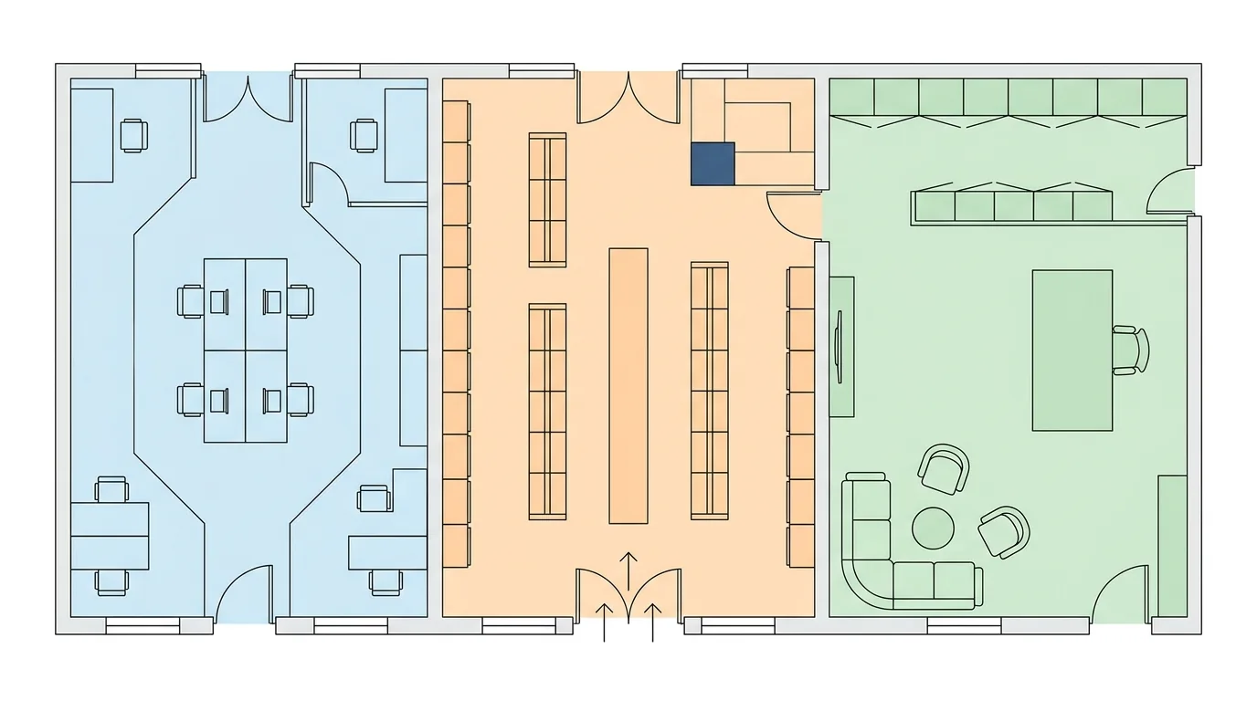
Caption: An office is about collaboration density, a retail shop is about customer traffic flow, and a studio is about space-efficiency zoning — each type of space has its own way of laying out
Office: When to Use Open-Plan, Island, and Single-Row Seating Clusters
Offices most commonly use three seating clusters. Open-plan puts everyone in the same space — fast collaboration and lower cost, but noise and privacy are the trade-off. Island clusters group a few desks together, giving a strong team feel, suitable for project-based groups. Single-row along the wall has the simplest traffic flow, suitable for narrow spaces or roles that need focus.
In practice, an office rarely uses just one type. The core team goes island, roles needing focus go single-row against the wall, and shared areas stay open-plan — mixing them best matches real needs.
Retail: Shelf Traffic Flow, Checkout Counter Position, and Customer Walking Paths
A retail space arranges not employee seats but "how customers browse." Shelf arrangement determines customer traffic flow, and the checkout counter is usually placed near the exit so customers naturally end up at the register after browsing. The aisle needs to let carts or crowds pass through so it doesn't jam at peak times.
When drawing a retail floor plan, first imagine a customer's path walking in from the door, then arrange shelves and displays along that path. Smooth traffic flow means longer dwell time — that's the core of retail layout.
Studio / Personal Commercial Space: Splitting Workspace, Reception, and Storage
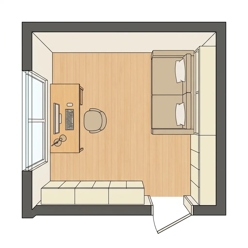
A one-person studio or small commercial space has limited square footage and needs to fit a workspace, reception area, and storage all into the same footprint. The priority is clear zoning — work happens where you can focus, receiving clients happens somewhere clean and presentable, and storage stays consolidated instead of scattered.
If it's a studio run out of your home, you also need to consider the boundary with home life. We wrote a separate article on this topic — Home Studio and Home Office Design Guide — covering how to lay out and store in small square footage.
Comparing the Three Templates Side by Side to Help You Find Your Fit
| Space Type | Layout Core | Common Templates | The One Thing That Matters Most |
|---|---|---|---|
| Office | Collaboration density and focus | Open-plan / island / single-row | Walkways and evacuation routes stay clear |
| Retail | Customer traffic flow and checkout flow | Shelves along walls + central aisle | Smooth traffic flow, checkout near exit |
| Studio | Zoning within limited square footage | Three zones — work, reception, storage | Clear zoning, maximum space efficiency |
Once you've found your fit, go back and check against the five core principles — seating density, walkway width, evacuation routes, department adjacency, natural light and orientation — one more time, and your layout will have a skeleton.
5Turn the Seating Chart Into a Team Proposal: Annotate With a Collaborative Editing Link, Export the Floor Plan for Managers and Designers
Finishing a seating chart isn't the end — it's the start of a conversation. This is especially critical under hybrid work — CBRE's 2026 data indicates 73% of companies see Tuesday as their peak attendance day (CBRE, 2026). With everyone coming into the office on different days, seating needs to be discussed together, not decided by one person alone.
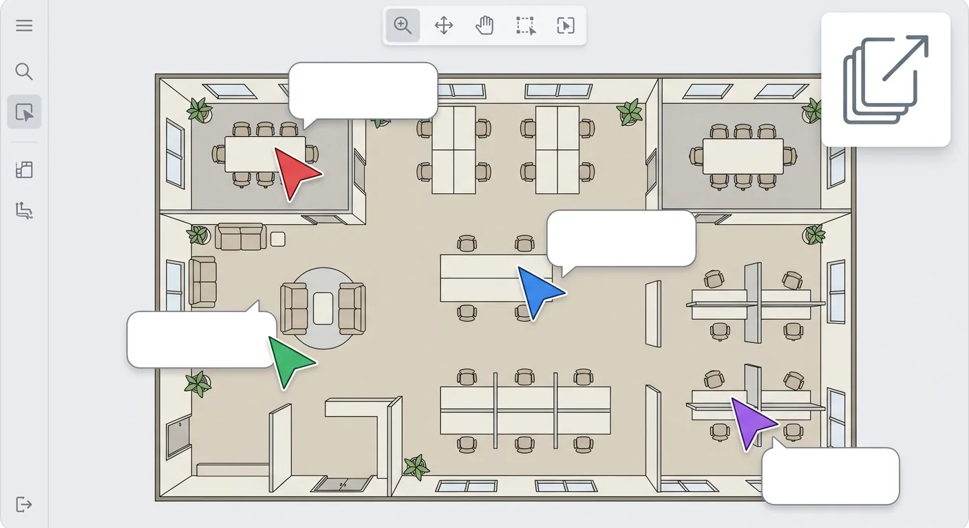
Caption: Generate a collaborative editing link, and the team leaves comments and drags positions on the same floor plan — once finalized, export it to managers and designers with one click
Generate a Collaborative Editing Link So Coworkers Can Comment and Drag Positions on the Same Floor Plan
Roomfit can turn a floor plan into a collaborative editing link. A coworker opens the link and can leave comments and directly drag their own position on the same chart, without relying on screenshots being passed back and forth in a group chat.
This is especially efficient for seating discussions where "everyone has an opinion." Whoever wants to switch seats, whichever zone feels too tight — mark it right on the chart, and it's obvious at a glance. The discussion goes from a long thread of text to one chart everyone can see.
Export the Floor Plan for Manager Sign-off and Designer Quotes
Once the discussion is finalized, export the floor plan as a PDF or image. It gives the manager something concrete to sign off on, and gives designers or furniture vendors an accurate base plan to quote from. Exports typically include dimensions and an object list, so whoever receives it can pick it up directly.
Compared to a verbal description of "roughly like this," a clearly documented export file is far more professional and cuts out a lot of back-and-forth confirmation.
Version Comparison: Lay Layout A and Layout B Side by Side, Discuss With Data Instead of Opinions
If you're torn between two layouts, the best approach is to save each as its own version and compare them side by side. Which one has a wider walkway, which one groups departments more tightly — discuss using the actual clearance and traffic flow numbers on the chart, instead of everyone going by feel.
When we helped a team make a decision, we laid "island clustering" and "single-row along the wall" side by side, and once the walkway numbers were on the table, the manager decided in three minutes — saving an entire meeting's worth of debate.
6Realtor Showings and Designer Proposals: Using the Same Floor Plan to Speed Up Communication
The same floor plan works just as well in a different scenario. With the housing market cooling, showings need to be more efficient — the Ministry of the Interior reports only 261,000 property transfers nationwide in 2025, a near nine-year low (Ministry of the Interior Real Estate Information Platform, 2026). With fewer transactions, every showing counts, and a floor plan with furniture already arranged helps a client get past the mental hurdle of "will it actually fit."
Realtor Showings: Arrange Furniture on the Vacant Unit's Floor Plan Before the Showing to Help Clients Visualize
An empty unit always looks spacious, and clients struggle to imagine how much room is left once a sofa, bed, and dining table are in. Before a showing, arrange common furniture onto the property's 1:1 floor plan first, and show it directly to the client during the showing — far more persuasive than gesturing around the empty space in person.
We put this approach together into an article, Essential Floor Plan Toolkit for Realtors, covering how showings and proposals can use a floor plan to speed up closing in more detail.
Designer Proposals: Use the Same Base Plan to Discuss Layout and Furniture Arrangement
When a designer presents a proposal, using the same floor plan as a base to discuss layout, traffic flow, and furniture arrangement makes it easier for the client to understand. Mark out the well-lit side, the squarest layout, and the functional highlights, and the client sees it immediately without needing to imagine.
Sharing the same base plan has another benefit: the realtor, designer, and homeowner are all looking at the same chart, so information doesn't get distorted through retelling.
Seating-Related Discussions and Experiences: A Roundup of Common Office Seating Forum Questions
On forums like PTT and Dcard, "office seating" is a popular topic — being assigned under a beam, facing the AC directly, too close to the restroom, a manager's desk facing everyone, and so on are all common complaints. These discussions actually reflect the consequences of not getting seating density, walkways, evacuation routes, department adjacency, and natural light and orientation right.
Feeding this feedback back into the seating chart is actually great material — mark the "landmine spots" when drawing the chart, and avoid them wherever you can. The value of a seating chart is turning these gut-feeling complaints into something you can see and discuss before seats are even assigned.
7Frequently Asked Questions
What software is used to draw an office seating chart? Can Excel do it?
Excel can do it — adjust column width and row height into a grid, fill in colors to zone, and type in names — suitable for a purely list-based seating list. But Excel's grid isn't true scale, making it hard to label clearance and walkways, and changing one position often means redoing the whole layout. If you need true 1:1 scale arrangement with automatic clearance labeling, an online floor-plan tool like Roomfit is more suitable. The full comparison and drawing method is covered in Office Seating Chart Tutorial.
What's the difference between a seating chart and a seating list?
A seating chart is a spatial position — which corner of the room a desk sits in, and how the walkway is left; a seating list is more like a name list or table, answering "which row is this person in." The two work best together: use the seating chart to arrange desks and walkways first, then use the seating list to map names to seat numbers. The chart handles space, the list handles names — clear division of labor keeps maintenance simple.
How much seating clearance and walkway width should you generally leave?
Per Taiwan's Building Technical Regulations Article 92, the general building corridor width floor is mostly 1.20 meters, rising to at least 1.60 meters when there are rooms on both sides and the floor's room area reaches 200 square meters or more (Laws & Regulations Database of The Republic of China). This is the regulatory floor — in practice, the main walkway should be left wider. Seating density commonly ranges around 9 to 14 m² per person, though the actual figure still needs confirming by arranging it once on the floor plan.
No professional drafting background — can one person still draw this?
Yes. Tools like Roomfit are drag-and-drop — you don't need to learn CAD or understand scale conversion. Input the space's length and width to build a 1:1 base plan, then drag desks and chairs into position, and the system automatically labels clearance. In 2026, these browser-based tools require no download or installation, so one person can lay out a version to share with the team. The hard part isn't the drawing — it's thinking through the five principles of seating density, walkway, evacuation route, department adjacency, and natural light and orientation.
Once the seating chart is drawn, how do you show it to the team and collect feedback?
The most efficient way is to generate a collaborative editing link — coworkers open it and can comment and drag positions right on the same floor plan, without screenshots being passed back and forth. Once finalized, export the floor plan as a PDF or image, giving managers and designers something concrete to sign off on or quote from. If you're torn between two layouts, lay A and B side by side and discuss with the actual walkway and clearance data on the chart — it reaches a conclusion faster than going by feel.
8Summary: Fit the Office Seating Chart Right at True Scale First, Then Talk Looks and Flow
An office seating chart settles "who sits where, where the walkways go, how to evacuate" all at once. From the definition and the five core principles, to the three templates for office/retail/studio, the core is always the same thing: fit the space right at true scale first, then talk about looks and flow.
The tool just makes it easier. Draw a 1:1 floor plan with Roomfit, drag desks and chairs with automatic clearance labeling, generate a collaborative editing link to share with your team, and finally export it for managers and designers — go through the whole chain, and you turn a vague layout in your head into something visible, discussable, and actionable. To draw your own, start with the measuring and drawing steps in Office Seating Chart Tutorial; for realtor and showing scenarios, see Essential Floor Plan Toolkit for Realtors.
9Related Reading
- Walkway Width and Traffic Flow Planning Guide
- Furniture Clearance and Walkway Safety Distance Guide
- The Complete Guide to Townhouse and Office Traffic Flow Layout Planning
10References
- CBRE — The Hybrid Reality: Why the Office Is More Important Than Ever
- Laws & Regulations Database of The Republic of China — Building Technical Regulations, Architectural Design and Construction Section, Article 92
- YAROOMS — Average Office Size: Square Feet per Employee Guide
- Gable — Office Space Planning: The Complete 2026 Guide
- Ministry of the Interior Real Estate Information Platform