Your manager tosses out a casual "can you sort out the seating," you open Excel, spend half an hour adjusting column widths, and halfway through you realize the desks don't even fit down the aisle. Most people have been there.
Making an office seating chart isn't as hard as it seems — the hard part is "measuring right, then drawing right." This guide starts with measuring your space and counting your desks and chairs, walks through how to draw a seating chart in Excel and its three limits, then covers four seating layouts — face-to-face, back-to-back, island, and single-row — and how to choose between them, finishing with a dimension cheat sheet you can copy directly. If you want the bigger picture first, head back to our Complete Guide to Workspace & Commercial Floor Plan Layouts for context.
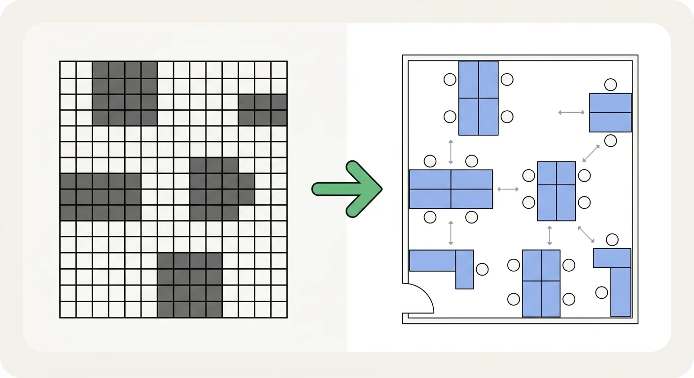
Caption: Excel grid seating chart vs. Roomfit 1:1 drag-and-drop — one is guesswork, the other is true-to-scale with auto-labeled spacing
Key takeaway: Making an office seating chart comes down to three parts: measuring and counting, choosing a layout, and getting the dimensions right. Under Article 92 of Taiwan's Building Technical Regulations, the minimum general corridor width is mostly 1.2 meters (Laws & Regulations Database of the Republic of China) — that's the hard floor your aisles can't go below.
1Before You Start: Measuring Your Space, Counting Furniture, and Listing Departments
Before you start drawing, get three things ready so you don't have to redo the whole chart later. This step gets skipped the most, yet it decides how accurate the whole chart ends up — by 2026, the average office space per employee has already dropped to roughly 100 to 150 square feet (about 9 to 14 square meters) (YAROOMS, 2026), and the tighter the space, the less room there is for sloppy measuring upfront.
We once laid out a seating plan for a client and missed a structural column — the finished chart looked fine on paper, but on-site we found two seats jammed right under the beam and had to redo the whole thing. Ever since, we always work through the measuring checklist first.
Measuring the Space: Length, Width, Columns, Doors, Windows, and Entrances
Grab a tape measure or laser rangefinder and get the room's length and width, while noting where the structural columns, doors, windows, and entrances sit. These "things that can't move" directly determine where desks can go and how the aisles have to bend around them.
Note which way each door swings, too. For inward-opening doors, the swing radius behind the door can't have a desk in it, or the door will hit it when opened. Catching this kind of detail on-site, while you're measuring, saves you from missing it later at the drawing stage.
Counting Desks, Chairs, Specs, and Existing Equipment
Next, count everything precisely: how many desks, how many chairs, and what size. Also note where printers, water coolers, dispensers, and photocopiers sit and how much space they take up.
Equipment gets forgotten easily, but it eats up a surprising amount of room. A large photocopier plus the clearance needed in front of it can take up as much floor space as an entire seat. Treat it as "furniture that can't be moved" when you're counting.
Organizing Your Department List and Seating Requirements
Finally, list out departments and seating needs: who needs a fixed seat, which seats can rotate, and which team has an unusually high number of meetings. This matters more and more under hybrid work — not everyone is in the office every day, so how shared seats get allocated needs to be worked out ahead of time.
Mark out "fixed vs. flexible" seats, and you'll know which spots need to be locked in and which can be shared flexibly. This list also becomes the working draft for your seating chart later.
2How to Draw an Office Seating Chart in Excel — and Its 3 Limits
Most people's first instinct is to draw a seating chart in Excel. It's doable: adjust column width and row height into near-square cells, use fill colors to mark zones, label departments and names, and you get a workable-looking chart. Free and something everyone already knows how to open — that's its biggest advantage.
But Excel has three limits you should know before committing to it. It's fine for an "office seating list" — mapping names to seat numbers — but drawing a "to-scale seating chart" is where it struggles.
Limit 1: Cells Aren't True Scale, Which Produces Fake Plans That Don't Actually Fit
An Excel cell is just a cell — it doesn't correspond to real centimeters or meters. Draw a desk two cells wide and an aisle one cell wide, and it looks neat, but the actual proportions can be completely off. The result: it fits on the chart, but when you move furniture in on-site, it doesn't fit at all.
This is the biggest trap in an "office seating chart in Excel." The grid gives you an illusion of precision, but that precision has nothing to do with real-world dimensions.
Limit 2: Desks and Chairs Have to Be Dragged Cell by Cell — One Change Means Redoing Everything
Excel has no concept of "objects" — a desk is just fill color and merged cells stitched together. Want to move a desk two cells to the right? You have to cut, paste, refill the color, and the surrounding cells often shift out of place too.
Seating charts are exactly the kind of thing that's "constantly changing." One more person, one fewer person, a team switching zones — Excel makes you redo a whole section every time, and the bigger the office, the more painful it gets.
Limit 3: It's Very Hard to Label Spacing, Aisles, and Escape Routes
The question a seating chart is supposed to answer most — is the aisle wide enough, is the escape route blocked, how much space is left between desks — is something Excel barely helps with at all. You're left mentally calculating how many centimeters each cell represents and guessing whether it's enough.
Yet those are exactly the things that matter most in a layout. An aisle narrower than the 1.2-meter minimum under Article 92 of the Building Technical Regulations, or an escape door blocked by a desk — these are hard to spot at a glance in Excel, and usually only get caught once you're on-site.
3A Faster Way: Drag True-to-Scale Desks and Chairs with Roomfit, with Auto-Labeled Spacing
Roomfit's approach directly fills in Excel's three gaps. It's a browser-based floor plan tool — no download, no install required in 2026 — built around "dragging at true scale." That's also the same idea as "get the 1:1 true-to-scale layout right first" from our complete guide.
We laid out the same office once in both Excel and Roomfit — the Excel version was still fighting with cells after three rounds of edits, while the Roomfit version flagged the aisle problem in the first round because spacing was labeled directly on the plan. The difference was almost an hour.
Start by entering the room's length and width, and the system builds a 1:1 base plan — one meter on the screen is one meter in real life. Then drag true-scale desks and chairs directly into position, and the system automatically labels the spacing between them. Where it's too tight, where the aisle isn't wide enough — you see it instantly, and moving one desk doesn't throw off the whole layout.
For anyone who just needs "a version ready to show the boss, fast," this beats wrestling with Excel's grid by a wide margin. Once it's done, you can generate a shared editing link for colleagues to help adjust, or export the floor plan to send to a designer for a quote.
4Office Seating Layouts in Practice: Face-to-Face, Back-to-Back, Island, and Single-Row Pros and Cons
The layout you choose shapes how your team collaborates and focuses — this section compares four common layouts. One thing worth knowing upfront: newly planned offices in 2026 mostly use a roughly "40% workstations, 60% shared space" ratio (Gable, 2026), so layouts are rarely used in isolation — they're usually mixed depending on each department's needs.
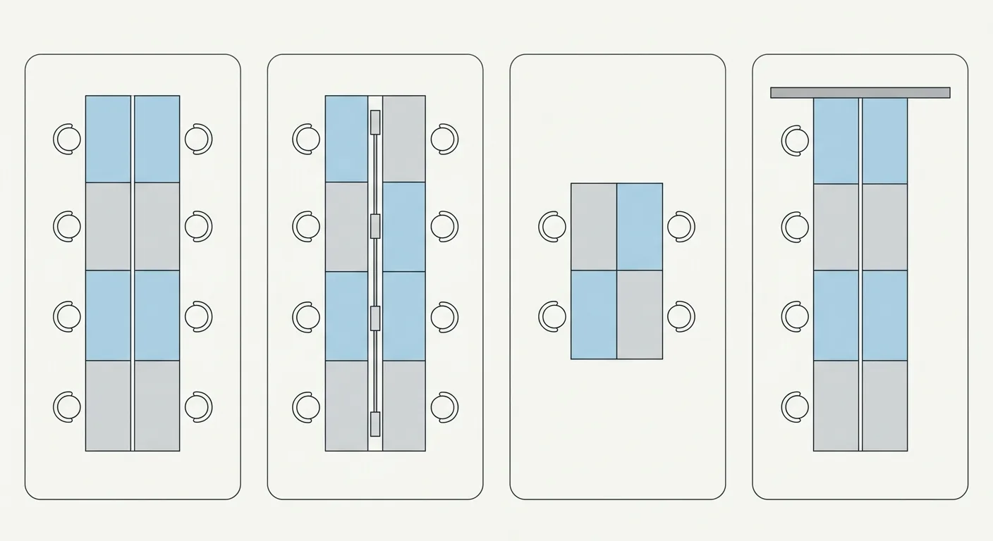
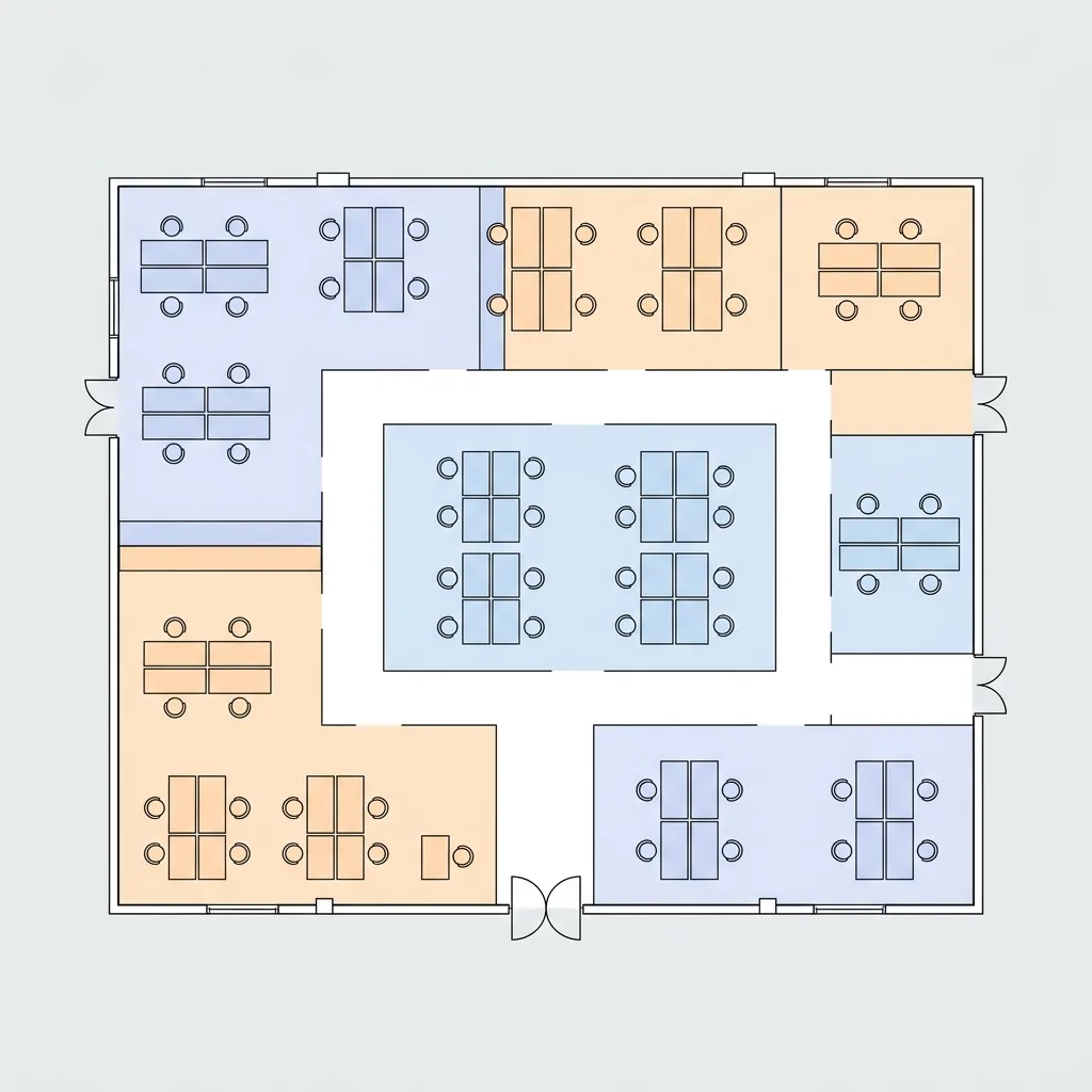
Caption: Four seating layouts — (1) Face-to-face (space-saving, collaborative) (2) Back-to-back (each person focused) (3) Island (strong team feel) (4) Single-row (simple traffic flow)
Face-to-Face: Space-Saving and Collaborative, But More Privacy Issues and Interruptions
Face-to-face puts two rows of desks facing each other, sharing a cable channel down the middle. It's the most space-efficient and makes handing off documents as easy as turning around. The trade-off is less privacy — you're looking at someone every time you glance up — and more interruptions. Good for small, tight-knit teams that collaborate heavily.
Back-to-Back: Each Person Stays Focused, But Watch Cabling and Screen Direction
Back-to-back has two rows of desks facing away from each other. Everyone faces a wall or a screen divider, which raises focus and reduces face-to-face distraction. Watch out for cable routing (the space behind desks is usually where cables bunch up) and monitors facing the walkway — screen content can easily be seen by people passing by. Good for setups that need focus while still saving space.
Island: Strong Team Feel, Good for Project Groups
Island layouts join several desks into a square or rectangular cluster, with a group seated around it. This gives the strongest sense of team, no need to move for meetings, and easy sharing of materials — great for project-based or agile teams. The downside is it takes up more floor space, and you need enough aisle room between islands or it starts to feel cramped.
Single-Row / Along-the-Wall: Simple Traffic Flow, Good for Narrow Spaces
Single-row lines desks up along one wall. It has the simplest traffic flow and doesn't block anything, which makes it especially useful in narrow spaces or awkward leftover areas along a corridor. It also suits roles that need deep focus and don't want to be disturbed. The downside is collaborating means walking farther, and the sense of team is weaker.
None of the four layouts is universally better — pick one based on what fits your department, then test it in Roomfit and lay out the actual aisle and spacing numbers side by side. That's the most reliable approach. This same "place it first, then judge how it looks" logic also applies to furniture test-fitting in our Home Studio and Home Office Design Guide.
5Office Seating Dimension Cheat Sheet: Desk Depth, Aisle Width, and Seating Spacing
Finally, here are numbers you can copy directly. Start with the strictest rule: aisle width has a legal minimum. Under Article 92 of the Building Technical Regulations, general building corridors must be at least 1.2 meters wide, and if there are rooms on both sides and the floor's habitable area is 200 square meters or more, it must be at least 1.6 meters (Laws & Regulations Database of the Republic of China). However you arrange the seats, the aisle can't fall below this line.
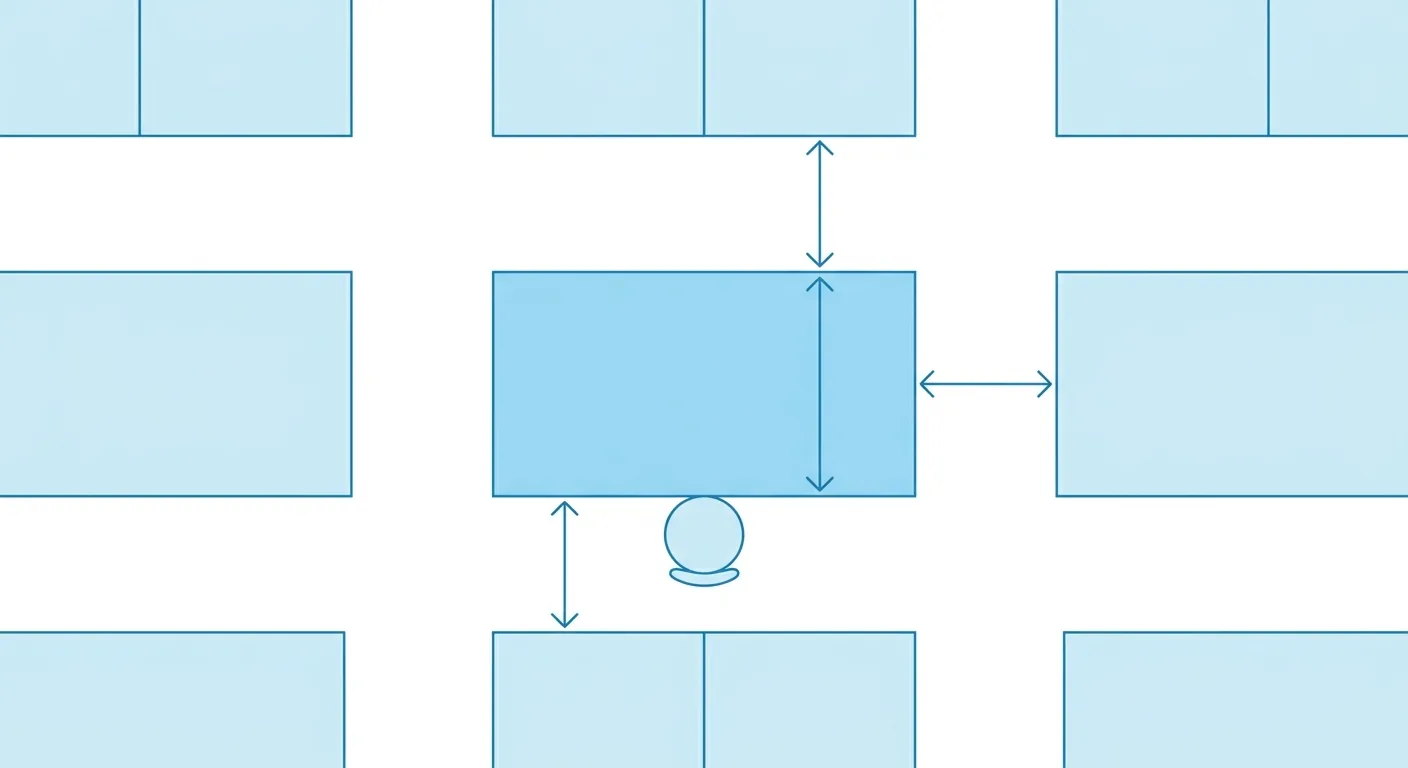
Caption: Three places to check seating dimensions — desk depth, the distance from the desk back to the aisle, and spacing between adjacent or back-to-back seats
Common Desk Sizes and Recommended Depth
Desk depth is generally recommended at 60 to 75 cm, with around 70 cm being the most balanced choice for most people (LiFArt, 2026). 60 cm works for basic paperwork or a single laptop; if you're running dual monitors or need surface space for documents, 70 to 80 cm gives you more breathing room.
Desk width depends on use — a single-person paperwork desk is commonly 120 to 140 cm wide. Too little desk depth and the screen ends up too close to your eyes; too much and it eats into aisle space. This is a trade-off best judged by laying it out on a plan once.
Aisle Width: Main Aisles vs. Secondary Aisles
The main aisle is the busiest thoroughfare — it's worth going wider than the 1.2-meter legal minimum so two people can pass each other sideways and a cart can get through. Secondary aisles run between rows and just need enough room for one person to pass comfortably, even with a chair pulled out.
A simple check: imagine someone sitting down and pushing their chair back — can someone still walk past behind them? That "clear width with the chair pulled out" is the real aisle width, not the desk-to-desk distance.
Seat Spacing: Minimum Comfortable Values for Back-to-Back and Side-by-Side
For back-to-back rows, leave enough room in the middle for both chairs to be pulled out and still let someone pass through. For side-by-side seats, leave enough space that elbows don't collide and standing up doesn't bump into anyone. These are "comfortable minimums," not numbers to shave down as far as possible.
Once you've settled on dimensions, the safest way to confirm them is still to lay everything out once on a 1:1 floor plan and see with your own eyes that it fits and the aisles are wide enough. That's exactly why we keep recommending a true-to-scale floor plan tool instead of just imagining it from numbers.
Copyable Dimension Cheat Sheet
| Item | Recommended Value | Notes |
|---|---|---|
| Desk depth | 60–75 cm (70 common) | 70–80 cm recommended for dual monitors / documents |
| Main aisle width | 1.2 m or more, wider recommended | Legal minimum; for two people passing |
| Secondary aisle width | Room for one person to pass comfortably | Measured as clear width with chair pulled out |
| Space per person | About 9–14 square meters | Includes aisles and common areas |
The figures above are general reference ranges for typical office spaces; always defer to your actual on-site dimensions and the Building Technical Regulations.
6FAQ
Is Excel or a Dedicated Tool Better for Making an Office Seating Chart?
It depends on the use case. For a list-style seating chart — mapping names to seat numbers — Excel is fine. But for laying out a to-scale seating chart with auto-labeled spacing and aisles, Excel struggles: its cells aren't true scale, and any change means redoing a whole section. Online tools like Roomfit work by dragging, need no download, and build a true-to-scale base plan as soon as you enter your dimensions — much less effort for a seating chart you keep adjusting.
How Deep Should a Desk Be?
Desk depth is generally recommended at 60 to 75 cm, with around 70 cm being the most balanced choice for most people (LiFArt, 2026). 60 cm suits basic paperwork and laptop use; if you're running dual monitors and need surface space for documents, 70 to 80 cm is more comfortable. Insufficient desk depth puts the screen too close to your eyes, which causes fatigue over long work sessions.
Is There a Legal Minimum for Office Aisle Width?
Yes. Under Article 92 of Taiwan's Building Technical Regulations (Building Design and Construction section), the minimum corridor width for general buildings is mostly 1.2 meters, rising to at least 1.6 meters if there are rooms on both sides and the floor's habitable area is 200 square meters or more (Laws & Regulations Database of the Republic of China). Aisles can't fall below this line when arranging seats, and in practice, main aisles are best kept even wider.
What Seating Layouts Are There, and How Do You Choose?
Four common ones: face-to-face (space-saving and collaborative, but more interruptions), back-to-back (each person stays focused, but watch cabling and screen direction), island (strong team feel, good for project groups), and single-row along a wall (simple traffic flow, good for narrow spaces). In practice, most offices mix layouts based on department needs — for instance, an island for the core team and a single row along the wall for roles that need focus — then use a floor plan to get the aisles right.
7Summary: Office Seating Charts Come Down to Measuring, Layout, and Dimensions
Making an office seating chart really comes down to three things: measure correctly first (space, furniture, department list), then choose a layout (face-to-face / back-to-back / island / single-row), and finally get the dimensions right (desk depth, aisles, spacing). Excel works fine for list-style seating charts, but for a to-scale seating chart, a 1:1 floor plan tool is far more practical.
When it's time to actually do it, enter your measured dimensions into Roomfit to build a true-to-scale base plan, drag desks and chairs into place, and fine-tune based on the auto-labeled spacing — you can get a version ready with aisles up to standard and departments clearly divided in one pass. For the bigger-picture principles and three floor plan types, go back to our Complete Guide to Workspace & Commercial Floor Plan Layouts; if you're a real estate agent using the same floor plan approach for listings and viewings, see our Real Estate Agent Toolkit.
8Related Reading
- Furniture Clearance and Aisle Safety Distance Guide
- Aisle Width and Traffic Flow Planning Guide
- TV Stand and Desk Dimension Comparison Chart
9References
- Laws & Regulations Database of the Republic of China — Building Technical Regulations, Building Design and Construction Section, Article 92
- LiFArt — How Deep Should a Desk Be? Choosing Between 60/70/75cm
- YAROOMS — Average Office Size: Square Feet per Employee Guide
- Gable — Office Space Planning: The Complete 2026 Guide