Interior Design Styles
Standing in front of the paint counter, drowning in hundreds of swatches, you finally pick one on a gut feeling — and regret it the moment it's on the wall. This is far too common a room-coloring experience. The problem isn't your eye for color — it's not having a set of principles to work from. Color schemes actually follow formulas; you don't have to rely purely on instinct.
This guide starts with the most practical rule of all — the 6:3:1 color ratio — then recommends popular palettes like gray, earth tones, and Morandi tones, solves the common pain point of a gray room feeling cold, and finally teaches you to "simulate before you paint" while tying your color choice back to your chosen style's palette direction. To see where this fits among the 8 major styles first, go back to the Interior Design Styles Overview.
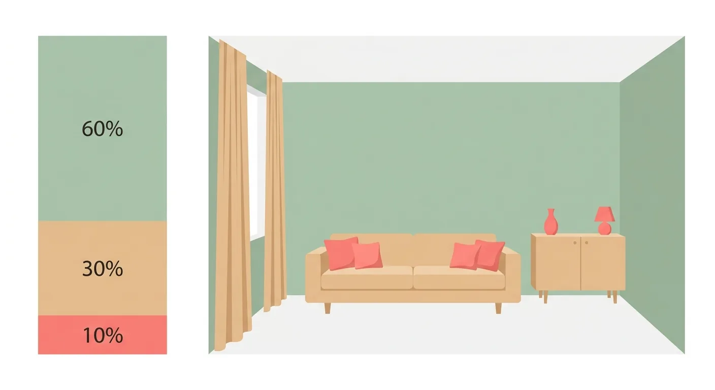
Caption: The 6:3:1 golden ratio for room color — 60% dominant color (walls), 30% secondary color (furniture, curtains), 10% accent color (cushions, decor)
Key takeaway: A study of 443 students found blue to be the most preferred room color (34.7%), with a significant association with calm mood (Costa et al., Frontiers in Psychology, 2018). Color isn't just about looking good — it shapes how you feel in the room.
The most practical principle for room color is the 6:3:1 rule: 60% dominant color, 30% secondary color, 10% accent color. This ratio avoids two extremes — "too many colors, looks chaotic" and "too monotone, no focal point." Color's effect is real: research finds specific colors have a significant association with mood, such as blue with calm (Costa et al., Frontiers in Psychology, 2018). Get the ratio right first, then worry about which colors to pick.
6:3:1 splits a room's color into three tiers, controlled by ratio. 60% is the dominant color, covering the largest area and setting the overall mood; 30% is the secondary color, doing the main coordinating work; 10% is the accent color, the finishing touch. This ratio comes from long-standing validation in design practice.
Its benefit is giving you a clear allocation framework. You don't have to agonize over "how much of this color should I use" — follow the ratio, and the scheme stays balanced.
The dominant color covers 60%, usually the walls, ceiling, and other largest-area surfaces. It sets the mood for the whole room — go light to expand the space, go dark to create a focused atmosphere. Because it covers the most area, the dominant color should be a timeless, hard-to-tire-of neutral.
The walls are the largest canvas in a room. Get the dominant color right, and you're already halfway to a successful scheme. That's exactly why many people recommend prioritizing renovation budget on the walls.
The secondary color covers 30%, usually the main furniture, curtains, and rugs, coordinating with the dominant color to add depth. The accent color covers 10%, applied to small-area items like cushions, decor, and artwork — the source of the whole room's highlight and personality.
The accent color is where you get to play the most. Because it covers a small area, costs less, and is easy to swap out, even a bold color choice here is easy to change if you get tired of it. If you want to go bold, put it in this 10%.
Here are three popular room color schemes: gray tones, earth tones, and low-saturation Morandi. Gray tones are versatile and timeless, great for beginners; earth tones are warm and comforting, echoing Wabi-Sabi and Japanese Minimalist; low-saturation Morandi is soft and refined, the hottest trend in recent years. Each comes with a dominant color and coordinating direction. Research also shows that neutral, timeless color schemes tend to be more popular in the market (Apartment Therapy/Fixr, 2025).
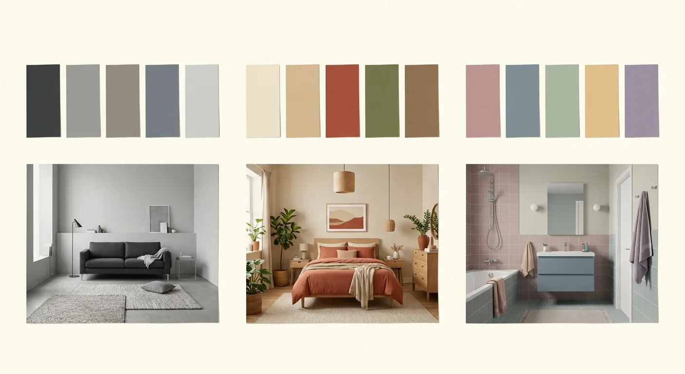
Caption: Three popular room color schemes — gray tones (versatile), earth tones (warm), low-saturation Morandi (refined)
Gray tones are the safest choice for beginners. They're versatile, timeless, and hard to tire of, pairing well with almost any furniture or soft furnishings. Light gray expands the space, dark gray creates focus, and there's a suitable shade for every kind of space from light to dark. U.S. market research also shows deep charcoal is a popular living room color (Apartment Therapy/Fixr, 2025).
Gray's only risk is feeling cold, which the next section addresses directly. Handle the coldness right, and gray almost never goes wrong.
Earth tones form a warm, comforting natural palette. Beige, camel, terracotta, and taupe — colors that seem to grow out of the earth — are calm and timeless, echoing Wabi-Sabi and Japanese Minimalist's natural tone. If you want your room to feel warm and relaxed, earth tones are a great choice.
Earth tones suit bedrooms especially well. Soft, warm tones help build a settled, sleep-friendly mood — for planning your bed, wardrobe, and traffic flow together, see the Bedroom Design Guide. To see how earth tones tie back into Wabi-Sabi, read the color section of the Wabi-Sabi Style guide.
Low-saturation Morandi is the hottest color trend in recent years. It's a soft palette made by adding gray to reduce a color's saturation — blue-gray, misty green, blush pink, warm taupe — looking refined and timeless. Morandi colors don't demand attention, but they carry real character.
The key to Morandi is "low saturation." The same blue, in a vivid shade, jumps out at you; add gray and it becomes a calm, refined Morandi blue. This is also a favorite accent color in Scandinavian style — to see how it's used there, check the color formula in Scandinavian Style.
Gray's most common pain point is feeling cold. The fix comes in three steps: first tell cool gray and warm gray apart by their undertone, then balance the coldness with warm materials like wood and fabric, and finally choose the right accent color. Master these three steps and even a gray room can feel warm and rich. Research notes that color significantly affects emotional perception (Costa et al., Frontiers in Psychology, 2018) — how well you color a gray room makes a real difference to how it feels to live in.
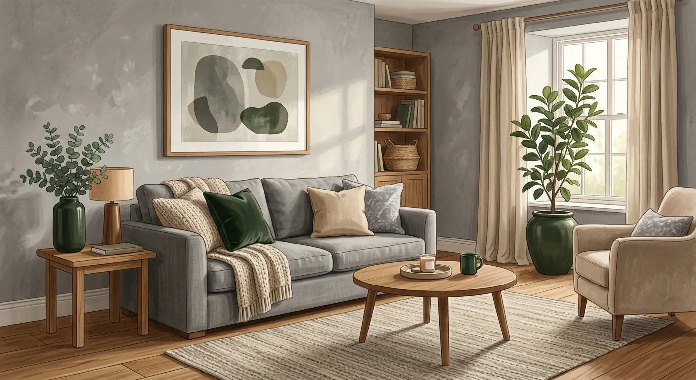
Caption: A gray room that doesn't feel cold — warm wood flooring + soft fabric + dark green and oat accents balance the coldness
Gray actually splits into cool and warm. Cool gray has a blue undertone, looking crisp but leaning cold; warm gray has a beige undertone, looking soft and rich. Both are called "gray," but they feel very different. Before choosing gray, first tell whether the swatch in your hand is cool gray or warm gray.
To avoid feeling cold, prioritize warm gray. If you've already chosen cool gray, you'll need to compensate with the materials and accents covered next. Understanding the cool/warm undertone is the first step in coloring with gray.
The most effective way to balance gray's coldness is adding warm materials. Warm wood flooring, a soft fabric sofa, a wool rug, rattan storage — these materials with real warmth neutralize gray's chill. A gray wall paired with warm wood is a classic, foolproof combination.
Material temperature changes how a color feels. The same gray wall reads colder paired with hard metal and glass, and warmer paired with warm wood and fabric. This is the key trick to keeping a gray room from feeling cold.
Gray is an excellent backdrop color, and pairs well with accents. Warm wood tones, oat, dark green, and blush pink are all good partners for gray, injecting warmth and life into a calm gray base. Apply the 6:3:1 rule's 10% accent to cushions, artwork, and decor.
Accent color is where a gray room gets its personality. Gray as the backdrop, accent as the star — a gray room built this way stays timeless without feeling boring. Do you want your gray room to lean warm or lean crisp? The answer is in your choice of accent color.
Always simulate before you paint. The gap between a small swatch and the effect of painting an entire wall is often big enough to cause real regret. Use an online tool to simulate your room's colors before you start, factoring in natural light and furniture colors together, and you'll save the cost and hassle of repainting. This is the most practical step in "choosing color without relying on a gut feeling." To narrow down your color inspiration into a single board first, pair this with the color application methods in the Mood Board Guide.
The gap between a swatch and a painted wall is the main reason so many people regret their paint job. A color that looks just right on a small swatch will look darker, more saturated, and more intense once it covers an entire wall, simply because of the larger area. This is called the "area effect," and almost everyone who's renovated a home has run into it.
Simulating first means seeing this gap coming ahead of time. Rather than discovering the color's too dark after it's painted, preview the effect on the whole wall with a tool before you start. The cost of a single repaint far exceeds the cost of simulating.
An online color simulation tool lets you test colors before committing. Upload a photo of your room or choose a room template, apply the color you want to the walls, and see the overall effect directly. Some tools also let you test different furniture and soft-furnishing combinations. This kind of "room color simulation" falls under digital tools — pair it with an Interior Design Simulator to test colors together, which dramatically cuts down the uncertainty in choosing.
The benefit of simulating is zero-cost trial and error. Test ten colors if you want — none of them require actually painting anything. Narrow it down to your favorites, then compare further.
When simulating, don't look at the wall color in isolation — factor in natural light and existing furniture colors at the same time. The same color looks completely different under strong versus weak light, and under warm versus cool light; the wall color also needs to work with your existing furniture and flooring. Looking only at an isolated wall color makes the simulation misleading.
Confirm your room's lighting conditions and furniture colors first, then bring them into the simulation. The color scheme you land on this way will actually reflect your home's real conditions.
Color should serve style, not go its own separate way. Settling on a style first, then a palette, is the key to avoiding a clashing tone. Each style has its own palette direction: Wabi-Sabi leans earthy, Japanese Minimalist leans solid and low-saturation, Scandinavian leans white-based with low-saturation accents, Cream style leans warm cream tones. When color and style line up, the space feels harmonious.
Each of the four popular styles has its own palette direction. Wabi-Sabi = earth tones, grays, low saturation, leaning rustic and calm. Japanese Minimalist = white, wood, and gray in solid colors, leaning clean and restrained. Scandinavian = white base + light wood + low-saturation accents, leaning bright and warm. Cream Style = cream white, oat, and caramel warm tones, leaning soft and comforting.
Each style's palette is part of its personality. To dig deeper into how each style handles color, read the color sections in Japanese Minimalist Style and Modern Minimalist vs. Cream Style.
The most common color mistake is a palette that clashes with the style. For example, pairing Cream style with cool gray, or Wabi-Sabi with high-saturation accent colors, both feel off. The right order is to settle on a style direction first, then choose colors from within that style's palette direction, so the color scheme never fights the style.
Style is the skeleton, color is the flesh. Build the skeleton first, then grow the flesh, and the space holds together. If you haven't settled on a style yet, go back to the Interior Design Styles Overview to pick a direction first, then come back and choose colors.
Color determines a room's mood, but furniture size determines whether it's livable day to day — the two need to be considered together. The visual weight of a dark or light color needs to match the scale of your furniture, so it's best to place your furniture into the room at the same time you choose colors. That's exactly why we recommend using Roomfit to lay out furniture alongside your color choices, so you avoid finishing the paint job only to discover the layout doesn't work or the color balance is off.
Color and furniture affect each other. A dark wall paired with bulky furniture feels oppressive; a light wall paired with lightweight furniture feels airy. Wall color depth, furniture bulk, and the room's proportions all need to be considered together — you can't look at wall color in isolation.
Picking only a wall color without considering furniture layout easily throws things off balance. Paint a dark wall, only to discover the big sofa makes the whole room feel stifling — that kind of regret is exactly what you avoid by placing furniture at the same time you choose colors.
Roomfit lets you upload your floor plan and place furniture into the room at true 1:1 scale, showing you the furniture's bulk and walkway clearances directly, with the system automatically marking the clearances. You can confirm before you paint: does this color scheme, paired with this furniture, get the visual weight and proportions right, and will the walkways be blocked?
Choosing colors and placing furniture at the same time means you won't finish the paint and buy the furniture only to discover the layout doesn't work. Get the fit right first, then worry about looks — that applies to color schemes too. After reading this, don't forget to go back to the Interior Design Styles Overview to settle your style and palette together.
Room color doesn't have to come down to a gut feeling. Start with the 6:3:1 rule to lock in the ratio of dominant, secondary, and accent colors, then choose from the three popular schemes — gray, earth tones, and Morandi — and if gray feels cold, balance it with warm wood, fabric, and accent colors. Before you pick up a brush, always simulate with an online tool, factoring in natural light and furniture colors together.
Remember that color should serve style — settle on a style first, then a palette. And since color determines mood while dimensions determine livability, use Roomfit to place your furniture into the room at true 1:1 scale at the same time you choose colors, confirming the visual weight matches. Get the fit right first, then worry about looks, and your room's color scheme will end up both beautiful and livable.
6:3:1 is the golden ratio that splits a room's color into three tiers: 60% dominant color, 30% secondary color, 10% accent color. The dominant color covers the largest area (walls, ceiling) and sets the overall mood; the secondary color is the main furniture, curtains, and rugs, doing the main coordinating work; the accent color goes on small-area items like cushions and decor, serving as the highlight and personality. This ratio avoids two extremes — too many colors looking chaotic, or too monotone with no focal point. Following the ratio keeps the scheme balanced, making it the most practical starting principle.
Three steps. First, tell cool gray (blue undertone) apart from warm gray (beige undertone), and prioritize warm gray if you want to avoid feeling cold. Second, neutralize gray's chill with warm materials like wood flooring, soft fabric, and a wool rug — a gray wall paired with warm wood is a classic combination. Third, choose the right accent color — warm wood tones, oat, dark green, and blush pink can all inject warmth into a calm gray base. Research shows color significantly affects emotional perception (Costa et al., 2018), so how well you color a gray room makes a real difference to how it feels to live in.
Because the gap between a swatch and the effect on a painted wall is huge. A color that looks just right on a small swatch will look darker, more saturated, and more intense once it covers an entire wall — this is the main reason so many people regret their paint job. Before starting, use an online color simulation tool, upload a room photo or choose a template, apply the color, and see the overall effect directly, while also factoring in natural light and furniture colors. Simulating is zero-cost trial and error — test as many colors as you want — which dramatically cuts down the uncertainty in choosing and saves the cost of a repaint.
Settle on a style first, then a palette. Color needs to serve style, not go its own separate way. Each style has its own palette direction: Wabi-Sabi leans earthy, Japanese Minimalist leans solid and low-saturation, Scandinavian leans white-based with low-saturation accents, Cream style leans warm cream tones. If the palette clashes with the style (say, Cream style paired with cool gray), it feels off. The right order is to settle on a style direction first, then choose colors from within that style's palette. Style is the skeleton, color is the flesh — build the skeleton first, then grow the flesh, and the space holds together.
Arrange furniture in your space at true 1:1 scale with Roomfit and see exactly how much walkway is left — no install, no sign-up.
Start with Roomfit →